A word on skin carries a particular kind of weight. A name, a line you live by, a phrase in another language, lettering says something plainly, and because it can be read, there is nowhere to hide. A leaf can be drawn a hundred honest ways, but a misspelled word is a misspelled word forever. That is exactly why script rewards a slow, considered approach: get the wording, the lettering and the placement right, and you have a piece that reads cleanly the day it heals and stays legible for decades. Here is how we think it through.
Choose the wording before anything else
Long before fonts or placement, settle on the words themselves, the exact words, spelled and punctuated the way you want them to live on you permanently. Write them down. Read them aloud. Sit with them for a few days, not a few minutes. The phrase that feels perfect on a Friday night is worth re-reading on a quiet Tuesday before it goes anywhere near skin.
If the line is a quote, confirm the source and the wording rather than trusting memory or the first result you find online. If it is in another language, have it checked by someone who genuinely speaks it, not a translation app, because grammar, accents and the shape of a character all matter, and a small error is invisible to you but obvious to a native reader. Keep it shorter than you think, too. A tight line of a few well-chosen words almost always carries more weight, and ages far better, than a long passage shrunk to fit.
A word can be read, so the spelling, the spacing and the source all have to be right before the needle goes anywhere near skin.
Finding a font that fits the meaning
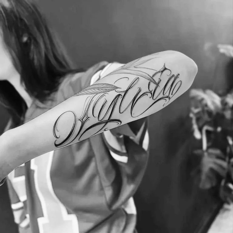
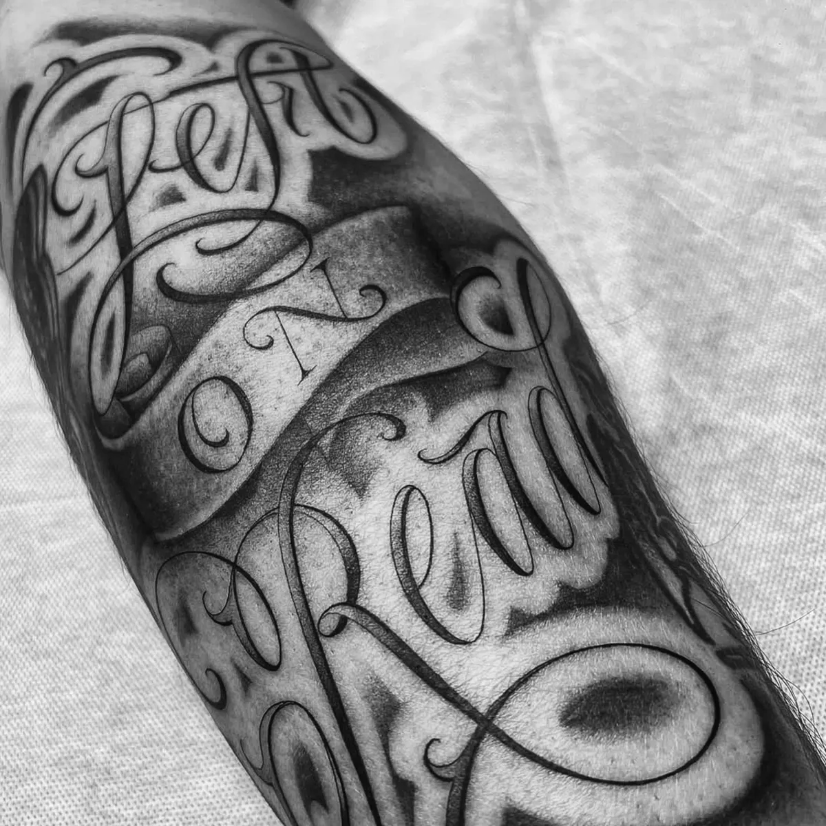
Lettering is its own craft, and the style of the letterforms does as much talking as the words. Flowing script feels personal and romantic; a clean serif reads classic and grounded; bold blackletter or old-school lettering carries a heavier, more graphic punch. The right choice is the one that suits both the meaning of the words and your own taste, a delicate single-needle script and a solid traditional banner send very different messages, even with the same sentence inside.
This is a conversation worth having with your artist rather than locking in a downloaded computer font and asking for an exact copy. A good letterer will hand-draw or adapt the lettering so it flows naturally, sits well on the curve of your body, and holds together as a single piece. Bring references, styles you are drawn to, the feeling you are after, and let the artist refine them into something made for you.
Why legibility has to come first
The most beautiful script in the world fails if no one can read it, including you. Highly ornate, tightly looped or very fine lettering can look stunning in a clean drawing on paper, but skin is not paper. Over the years, lines spread very slightly as the tattoo settles and ages, and letters that sit too close together or too thin can blur into one another until a word becomes a smudge. We always weigh the design against how it will look not just freshly healed, but in ten and twenty years.
The practical fixes are simple. Give the letters a little breathing room, keep the lines a sensible weight rather than hair-thin, and resist cramming a long phrase into a small space. A slightly larger, more open piece of lettering will stay readable for life, where a tiny intricate one risks becoming a faded shape. If you are torn between fitting more words and keeping it clear, clarity wins every time.
Placement, flow and reading direction
Where lettering sits changes how it reads. A line of script flows beautifully along the natural lines of the body, down a forearm, along a collarbone, around a wrist, up the ribs, and the best placements follow those contours rather than fighting them. Think about which way the words run, too: a phrase along the inner forearm reads naturally to you looking down, while one across the chest or back is angled for others. Neither is wrong; it just helps to decide who the words are really for.
Curved placements like a wrist or ankle ask for shorter wording so the line does not distort as it wraps. Longer lines want a flatter, more generous run of skin. Your artist will mock the lettering up as a stencil and place it on you before any needle touches down, so you can see the flow, the size and the angle on your own body and adjust until it feels right. If you would like to think placement through more broadly, our guide to choosing the right placement goes deeper.
Good lettering follows the body, it runs with the curve of an arm or a collarbone, never fights against it.
Spelling, proofing and a final check
This is the step that matters most and takes the least effort: proof the words, then proof them again. Once a stencil is placed, read every letter slowly, out loud is best, and check spelling, spacing, accents and punctuation against your written-down version, not your memory. Have a friend read it too if you can; a second pair of eyes catches what yours skim past.
A careful artist will go through the stencil with you precisely because this is the one error nobody wants to live with. Take that moment seriously and do not rush it, no matter how keen you are to start. Five quiet minutes of checking is nothing against a permanent typo. If something looks even slightly off, say so, adjusting a stencil is easy, and it is exactly what that step is for.
How script ages, and keeping it sharp
Lettering ages like any tattoo: lines soften a little, and very fine detail blurs faster than bold work. Designing it open and legible from the start is the best protection, but care matters too. Sun is the main enemy of crisp lines, under the Australian sun especially, a well-applied sunscreen over a healed piece keeps the edges sharp for far longer. A well-spaced, sensibly weighted line of script, looked after, can stay clean and readable for a very long time. For the longer view, our guide to how tattoos age over time is worth a read.
If a much-loved older piece of lettering has softened, a touch-up can often re-sharpen the lines and bring it back. General care advice like this is no substitute for medical attention, if a healing tattoo shows signs of infection such as spreading redness, heat, swelling or pus, see a doctor. Otherwise, with the wording settled, the lettering chosen with care and the spelling checked twice, you have a piece of script that will say exactly what you meant, clearly, for years to come.