Most people arrive at their first tattoo with a clear idea of what they want, a flower, a portrait, a few words, and far less sense of how they want it drawn. Yet the style is what gives a piece its character. The same subject can be rendered as soft grey shading, bold black outlines, or something photographic, and each choice carries a different feel, suits different placements, and ages in its own way. Understanding the main styles before you book takes a lot of the guesswork out of the conversation, and it helps your artist steer you towards the version of your idea that will still look right in twenty years. Here is a plain-language tour to help you find yours.
Why style matters more than you think
A style is not just a look, it is a set of decisions about line weight, contrast, colour and detail, and every one of those decisions affects how a tattoo wears over time. Bold, simple work with strong outlines tends to hold its shape for decades. Very fine, delicate work is beautiful up close but asks more of your skin and your aftercare as the years pass. None of this means one style is “better” than another; it means each has a personality, and the trick is matching that personality to your idea, your skin and the part of your body you have in mind.
Getting the style right early also makes the whole process smoother. When you can say “I am thinking fine line, black and grey” rather than just “a small flower”, your artist can show you relevant examples, flag what will and will not work at that size, and design with intent from the first sketch.
The subject is your what. The style is your how, and the how is what gives a tattoo its voice.
Traditional and bold styles
Traditional tattooing, the bold outlines, solid colour and time-tested imagery of anchors, roses and swallows, endures for a reason. The heavy linework and strong contrast are built to age well; these pieces stay legible and punchy long after finer work has begun to soften. If you want something that reads clearly from across a room and still looks crisp decades on, this is a style to take seriously. It is graphic, confident and unfussy, and it sits beautifully on arms, calves and other larger, flatter areas.
The same logic extends to neo-traditional work, which keeps the bold-line backbone but allows for richer colour, more depth and a wider range of subjects. If you love the durability of traditional but want a more illustrative, contemporary feel, this is often the middle ground.
Fine line and delicate work
At the other end of the spectrum is fine line: thin, precise single-needle work used for minimalist botanicals, small script, subtle symbols and elegant detail. It is quietly striking and well suited to people who want something understated rather than bold. The honest trade-off is longevity, very fine lines have less ink in the skin to begin with, so they can soften or fade a touch faster than heavier styles, particularly on high-movement areas. That is not a reason to avoid it, simply a reason to choose placement carefully and stay on top of sun protection and the occasional touch-up.
Fine line rewards an artist with a steady, patient hand, which is exactly the kind of considered work we enjoy. If a delicate piece is what you are drawn to, our guide to fine line versus traditional weighs the two approaches in more detail.
Realism and portraits
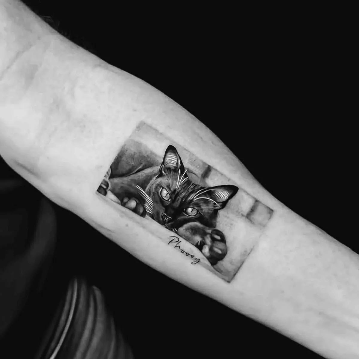
Realism aims to reproduce something, a face, an animal, a flower, a photograph, as faithfully as skin allows. Done well it is breathtaking, and it is among the most technically demanding styles there is. It leans on smooth gradients, careful shading and a real understanding of light, which is why realism pieces tend to need more time in the chair and a generous amount of space to breathe. Cram a detailed portrait too small and the fine transitions blur together as it heals and ages; give it room and it holds beautifully.
If you have a realistic piece in mind, think about scale and placement from the start, and look closely at an artist’s healed examples rather than just the fresh ones. It is a style worth being patient for.
Blackwork, lettering and colour
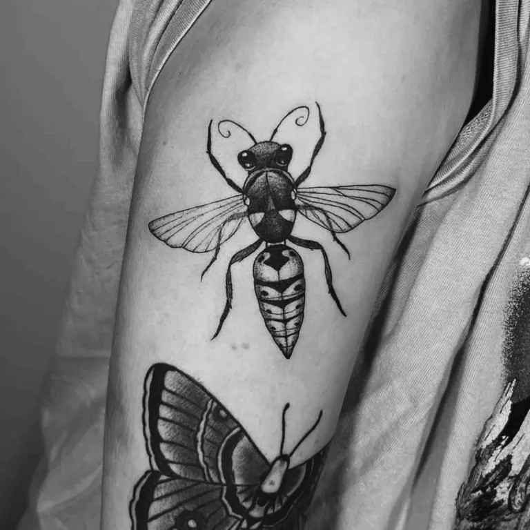
Blackwork covers a broad and enduring family, from fine ornamental botanicals to bold solid fields and graphic patterns, all built from black ink alone. It is one of the most durable styles going, holds its contrast over time, and reads cleanly at almost any size. If you are drawn to strong, graphic imagery, our piece on blackwork explained is a good next read.
Lettering and script deserve their own thought. Words on skin carry weight, so the font, spacing and placement matter as much as the wording itself, tight, ornate scripts can blur if set too small, while clean lettering with breathing room ages gracefully. And then there is the colour question. Colour brings warmth and energy; black and grey offers timeless depth and tends to be the lower-maintenance option over the long run. Neither is the right answer for everyone, which is why we walk through it properly in colour versus black and grey.
Don’t force a single style if your idea spans several, a good artist will blend them into something that still reads as one piece.
How to find the style that fits you
Start by collecting work you genuinely love, not just images of your subject. Save tattoos whose feel appeals to you, the line weight, the amount of colour, the level of detail, and look for the threads they share. That reference pile tells an artist far more than a single description, and it often reveals a style preference you had not put into words. Bring it to your consultation.
Then weigh the practical side honestly. Where will the tattoo live, how detailed is the idea, and how much upkeep are you happy with? A small, high-movement spot will not flatter a heavily detailed realism piece; a bold traditional design will look at home almost anywhere. Placement and style are a pair, so it is worth reading our note on choosing the right placement alongside this one. Above all, lean on your artist, describing the look you are after and letting them recommend the style that will execute it best is one of the most useful conversations you can have.
The takeaway
There is no single “best” tattoo style, only the one that fits your idea, your skin and how you want it to age. Bold and traditional work for longevity and clarity; fine line for understated elegance; realism for faithful detail; blackwork for graphic strength; colour or black and grey for the mood you are after. You do not need to arrive an expert, a few favourites saved, an honest sense of your placement, and an open conversation are more than enough to land on the right direction together.
One last, sensible note: a tattoo is a medical procedure on your skin. Choose your style and artist with care, follow the aftercare you are given, and if a healing tattoo ever shows signs of infection, spreading redness, heat, swelling or pus, see a doctor.